For my web site I wanted a visual element that would stand out and grab attention from the very beginning. Animation was an obvious choice. That was the start. What to animate and how is the real story.
If you’ve seen any of the Transformers films, you know the core visual hook — ordinary objects disassemble and rearrange their parts into something entirely different. It’s compelling because the transformation itself tells a story. You see where things came from, and you see where they end up.
The domain dataxroads reads data-crossroads (short name dxr).
Letters D, X, and R can be broken down into simple geometric shapes. I choose them to be the starting form of the animation.
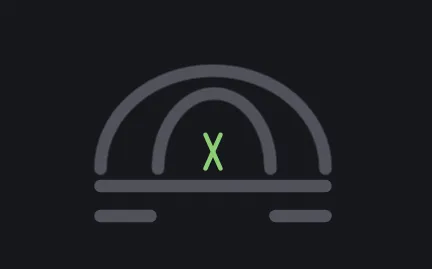
What to transfer into? Surely not yet another UFO? Well, why not? Thematically, it fits. Association with technology is obvious. Transformation from simple letters (input data) into a complex and powerfull product is closely related to the data and web services offered by this company.
A flat horizontal base, two short lines as landing gear, a large dome above, and a smaller dome at the centre — with the X shape glowing inside it as the power core. The X stays green throughout the animation, maintaining its identity as the symbolic heart of the brand even as everything around it shifts.
Building the Shapes in SVG
Each letter is drawn using SVG path elements — the most flexible drawing tool in the SVG toolkit. A path can describe straight lines, curves, and arcs using a compact coordinate syntax. It’s like a set of precise instructions to a pen: start here, draw a line to here, curve around to here, stop.
The seven paths are grouped inside a single SVG element, sized and positioned near the top of the page. Before the animation begins they simply look like the letters D, X, and R, rendered in thin strokes against the dark background.
<!DOCTYPE html>
<html lang="en">
<head>
   <meta charset="UTF-8">
   <meta name="viewport" content="width=device-width, initial-scale=1.0">
   <title>SVG Animation with AnimeJS</title>
   <style>
      body {
         background: #17181c;
         color: #cde4de;
      }
      #mainbox {
         width: 100%;
         height: 80vh;
         overflow: hidden;
         z-index: 1;
      }
      .title {
         font-size: 1.5rem;
         color: aliceblue;
         padding: .5rem 0 0 1rem;
      }
      .misc_txt  {
         color: aliceblue;
      }
      .cname   {
         font-size: 1rem;
         color: skyblue;
         margin: .8rem 0 0 0;
      }
      #cname-x {
         font-size: 1.1rem;
         color: limegreen;
      }
      /* svg elements */
      #svgobj {
         position: absolute;
         transform-origin: center center;
         top: 10px;
         right: 50px;
         z-index: 10;
         opacity: 1;
      }
      path {
         transform-origin: center center;
         stroke-linecap: round;
      }
      #line1_x,
      #line2_x {
         transform-origin: center center;
         z-index: 10;
      }
      #arc_d {
         transform-origin: 45px center;
         z-index: 10;
      }

      #arc_r {
         transform-origin: 100px center;
         z-index: 10;
      }
   </style>
</head>
<body>
   <div class="title">SVG Animation with AnimeJS <div class="cname"><span class="misc_txt">by </span> milo@data<span id="cname-x" class="">Χ</span>roads.com</div></div>
   <div id="mainbox">
      <!-- dXr - using SVG shapes  -->
      <svg width="160" xmlns="http://www.w3.org/2000/svg" viewBox="0 0 160 100" id="svgobj">
         <path d="M 10 5 L 10 95" stroke="#52525b" stroke-width="4" id="line-d" />
         <path d="M 10 5 A 2 2.3 0 0 1 10 95" stroke="#52525b" stroke-width="4" fill="none" id="arc_d" fill="red" />
         <path d="M 60 5 L 100 95" stroke-width="4" stroke="#8cce76" id="line1_x" stroke-linejoin="miter"
            stroke-linecap="round" stroke-miterlimit="10" />
         <path d="M 100 5 L 60 95" stroke-width="4" stroke="#8cce76" id="line2_x" />
         <path d="M 120 5 L 120 95" stroke="#52525b" stroke-width="4" id="line1-r" />
         <path d="M 120 50 L 155 95" stroke="#52525b" stroke-width="4" id="line2-r" />
         <path d="M 120 5 A 2 1.5 0 0 1 120 50" stroke="#52525b" stroke-width="4" fill="none" id="arc_r" />
      </svg>
   </div>
   <script></script>
</body>
</html>
Animating the Transformation
The animation is handled by Anime.js v3, a lightweight JavaScript animation library. It runs each transformation step in sequence using a timeline — one action completes, the next begins. The operations themselves are straightforward: scale, rotate, translate, and — most critically — morph the d attribute of specific SVG paths to change their shape mid-animation.
That last technique is worth pausing on. SVG paths can be animated between two different shapes as long as both shapes have the same number of points. This is how the leg of the R becomes a landing strut, and how the stem of the D shortens into a flat base. The shapes don’t disappear and reappear — they flow from one form into another. That fluidity is what gives the animation its character.
Calculating the correct coordinates for each transformed shape — and ensuring the screen-size adjustments kept everything proportional on both mobile and desktop — required more than a few restarts. Having personaly taken part in choreographed tango dance performances I felt that the code that controls movement of the SVG shapes had quite a few similarities.
Animation Time Adjustments
The full animation runs for just over five seconds. Looking at this number on its own it may seem that the animation is too long. That was a deliberate choice because anything shorter would disrupt the flow and lessen the effect. Animation is stripped to a bare minimum, and each step is long just enough to let each transformation feel complete, and short enough to avoid feeling like a loading screen.
It is worth being honest about the trade-off. UX generally favours brevity for introductory animations. The underlying principle — don’t make users wait — is relevant. My reasoning is that this animation shows by example character of the work advertised on this page, and that the overall experience it produces will ultimately prove to be more benefitial than staying within strict time constraints.
   <script src="https://cdnjs.cloudflare.com/ajax/libs/animejs/3.2.2/anime.min.js"></script>
   <script>
      var docW = window.innerWidth;
      var docH = window.innerHeight;
      // * * DXR LETTERS ANIMATION
      var anim0 = anime.timeline({ loop: false, autoplay: true });
      anim0
         .add({
            targets: '#svgobj',
            top: docW < 1024 ? docH * .55 : docH * .42,
            left: docW < 1024 ? docW * .3 : docW * .72,
            scale: [1, 2],
            opacity: [.2, 1],
            duration: 900,
            easing: 'linear',
         })
         .add({
            targets: "#line1_x, #line2_x",
            scale: .15,
            strokeWidth: 5,
            delay: 350,
            duration: 450,
            easing: 'linear'
         })
         .add({
            targets: '#arc_d',
            rotateY: '180deg',
            strokeWidth: 5,
            duration: 450,
            easing: 'linear'
         })
         .add({
            targets: '#arc_r',
            rotateY: '180deg',
            translateY: 22,
            strokeWidth: 5,
            duration: 450,
            easing: 'linear'
         })
         .add({
            targets: '#line2-r',
            d: "M 87 5 L 87 95",
            strokeWidth: 5,
            duration: 450,
            easing: 'linear'
         })
         .add({
            targets: '#line-d',
            d: "M 99 5 L 99 25",
            strokeWidth: 5,
            duration: 450,
            easing: 'linear'
         })
         .add({
            targets: '#line1-r',
            d: "M 99 75 L 99 95",
            strokeWidth: 5,
            duration: 450,
            easing: 'linear'
         })
         .add({
            targets: '#svgobj, #line1_x, #line2_x',
            rotate: '90deg',
            duration: 450,
            easing: 'linear'
         })
         .add({
            targets: "#line1_x, #line2_x",
            strokeWidth: 14,
            duration: 450,
            easing: 'linear'
         })
         .add({
            targets: "#line1_x, #line2_x",
            strokeWidth: 12,
            translateY: 45,
            duration: 450,
            easing: 'linear'
         })
         .add({
            targets: '#svgobj',
            left: 20,
            top: 70,
            scale: .6,
            opacity: [1, .4],
            duration: 1000,
            easing: 'easeInOutCubic',
         });
   </script>
Why Anime.js?
Anime.js has earned its place as one of the most approachable JavaScript animation libraries available. Its timeline API makes it straightforward to sequence multiple animations with fine control over delay, duration, and easing — all of which matter enormously when you are trying to make a transformation feel smooth rather than mechanical. The library is lightweight at around 17kB minified, has no dependencies, and its documentation is clean and example-rich. For developers who are used to working with CSS @keyframes the step up to Anime.js feels natural. It handles SVG properties, CSS properties, and JavaScript objects with a single API.
Why SVG for Web Animation?
SVG — Scalable Vector Graphics — is defined in plain text using XML syntax, which means it lives directly in the HTML document and is fully accessible to JavaScript and CSS. This is a meaningful advantage over canvas-based or image-based animation: every element inside an SVG can be targeted, styled, and animated individually. A path, a circle, a group of shapes — all are addressable by ID or class, just like any other HTML element. SVG also scales without quality loss at any screen resolution, making it particularly well-suited for logos and UI elements that need to look sharp on both a mobile screen and a 4K display. File sizes for SVG assets are typically a fraction of equivalent raster images. An SVG can be 90% smaller than its WebP equivalent for the same visual content. For animations that need to feel precise, responsive, and performant, SVG is often the right choice.