In part 1 I described creating an image — a dark canvas filled with colorful hexadecimal characters — that was meant to be the core visual element of my web site. I started looking for more ways to reuse this image throughout the page.
Reusing it isn’t laziness. It is about consistency and sharing visual DNA with the rest of the site, reinforcing a coherent design language and patterns rather than introducing a new one.
Adding more prominent graphics to the page was not an easy decission. One problem is that it can distract from more valuable content. It can create unnecessary tension by competing with the main visual element
(the top page animation).
Therefore it had to be closely visually aligned with the main theme, and support it rather than dilute its effect.
Blast From The Past
Good web design is full of small details which a visitor might not notice right away but would definitely miss if they were gone. A section divider is such a detail. Done poorly, it’s a horizontal line that implies “we’re trying to keep it simple or, maybe, we just ran out of ideas.” If done right, it becomes a small piece of the site’s personality.
I remember the early stage of HTML design when flashy section dividers were quite popular. People often used all kinds of fancy ornaments to transition between disparate content.
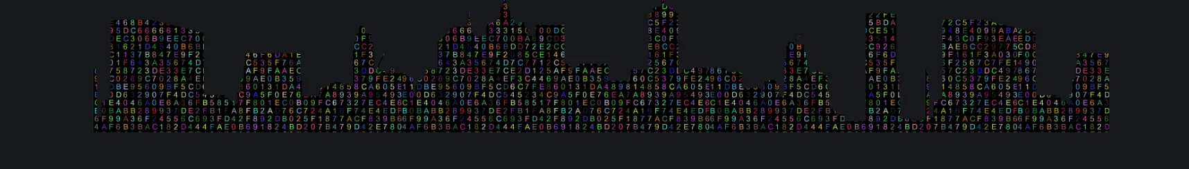
That gave me an idea of creating a section divider filled with my theme image (hexadecimal data). I found a good spot for it and hoped for the best.
However, it looked rather out of place and purposeless. It was obviously placed on the page just for the sake of having it there. Simple rectangle filled with numbers didn’t indicate purpose but an idea of a digital city does.
How To Build It Step by Step
First, find and download a skyline image with transparent background. SVG file format may be the easiest for setting the background rectangle color to none/transparent. SVG is a vector format meaning it scales cleanly at any size without pixelation. This makes it particularly well-suited for use as a mask.
Create a div element 200 pixels tall and 100% wide. It is tall enough to register as a deliberate design element, but short enough to stay out of the way of the content on either side of it.
Set background-image css property to our core theme image. At this point the divider is simply a rectangle filled with colorful data characters — interesting on its own, but not yet shaped.
CSS mask-image accepts an image file and uses it as a stencil — only the parts of the element that fall within the opaque areas of the mask remain visible. Everything else disappears.
Now, we use that image as a mask for the section. Since we already have a nice background image for this element we can set its “background-size” property to “contain” (practically make it appear smaller) to make it look like we have a thousand tiny lights filling up the buildings. It is still visible that those lights are actually numbers and letters – data.
Apply a simple css animation to turn the lights (background) on and off (using opacity css property) and that’s about it.
Simple but effective. The result: a digital city skyline that pulses between light and dark, as if the city is cycling through night and day. The message is that data is intertwined with our daily life and most often we don’t even notice.
Most importantly this element is consistent and supports the overall theme which is data in its many forms.
Another important detail is that it was created entirely in HTML and CSS. No extra libraries or JS code.
The skyline image I used is roughly 500×100 pixels so to cover the whole page width I set css property mask-repeat: repeat-x;
We can alter animation by changing the time length and the easing function. This is also worth paying attention to . Easing is one of those CSS animation properties that separates animations that feel right from ones that merely work. A linear fade and a cubic-bezier fade cover the same distance, but one feels mechanical and the other feels alive.
<!DOCTYPE html>
<html lang="en">
<head>
   <meta charset="UTF-8">
   <meta name="viewport" content="width=device-width, initial-scale=1.0">
   <title>Animated HTML Section Divider</title>
   <style>
      body {
         background-color: hsl(220, 10%, 10%);
         color: silver;
         padding: 1em;
         font-size: 1.5rem;
      }
      h1, h2 {
         color: lightcyan;
      }
      h1 {
         text-align: center;
      }
      li {
         margin: .7em;

      }
      a:link {
         color: aquamarine;
         text-decoration: none;
      }
      a:hover  {
         color: darkturquoise;
         text-decoration: underline;
      }
      a:visited {
         color: cornsilk;
      }
      .top,
      .bottom,
      .credits {
         margin: 3em;
         padding: 2em;
         border: 2px solid darkslategrey;
         background-color: hsl(220, 15%, 15%);
      }
      #div_city {
         margin: 6em;
         height: 200px;
         background-color: hsl(131, 14%, 15%);
         background-image: url(./img/txt_clr.jpg);
         background-size: contain;
         mask-image: url(./img/city-skyline-bottom.svg);
         -webkit-mask-image: url(./img/city-skyline-bottom.svg);
         mask-repeat: repeat-x;
         -webkit-mask-repeat: repeat-x;
         mask-size: contain;
         -webkit-mask-size: contain;
         mask-position: 0 0;
         -webkit-mask-position: 0 0;
         animation: on_and_off 10s cubic-bezier(0.755, 0.05, 0.855, 0.06) infinite;
      }
      @keyframes on_and_off {
         0% {
            opacity: 1;
         }
         25% {
            opacity: 0.5;
         }
         50% {
            opacity: 0;
         }
         75% {
            opacity: 0.5;
         }
         100% {
            opacity: 1;
         }
      }
      .txt {
         font-size: 1.5rem;
      }
   </style>
</head>
<body class="">
   <h1>Animated HTML Section Divider</h1>
   <div class="top">
      <p>
         Everyone realizes why a new common language would be desirable: one could refuse to pay expensive
         translators. To achieve this, it would be necessary to have uniform grammar, pronunciation and more common
         words.
      </p>
   </div>

   <div id="div_city"></div>

   <div class="bottom">
      <p>
         If several languages coalesce, the grammar of the resulting language is more simple and regular than that of
         the individual languages. The new common language will be more simple and regular than the existing European
         languages. It will be as simple as Occidental; in fact, it will be Occidental.
      </p>
   </div>

   <ul class="credits">
      <h2>Credits</h2>
      <li><a href="https://www.blindtextgenerator.com/lorem-ipsum">Lorem text generator</a></li>
      <li><a href="https://developer.mozilla.org/en-US/docs/Web/CSS/Reference/Properties/animation">MDN Reference -
            CSS Animation</a></li>
      <li><a href="https://www.freepik.com/">Freepik skyline image</a></li>
   </ul>
</body>
</html>
For a thorough reference on CSS animation properties including easing, the MDN documentation is the place to start.
Detailed reference (including visuals) of various easing easings.net.